Accessibility is one of those things everyone agrees is important and far fewer people actually build in from the start. It gets treated as a final step, a box to tick before launch, or worse, something to worry about only if a learner complains.
I want to offer a different way of thinking about it. Accessibility is not a compliance chore. It is just good design that happens to help people who would otherwise be shut out. A course that works for someone using a screen reader or navigating by keyboard is usually a clearer, better-built course for everyone.
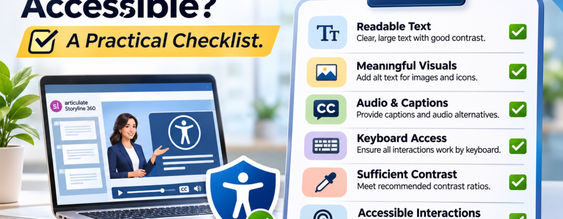
So here is a practical checklist I use when building in Storyline. It is not exhaustive, and it is not a substitute for real testing with real users. But it will catch the issues that trip up most courses, and it will get you most of the way there.
Start With Structure and Focus Order
Before anything else, make sure the course can be navigated without a mouse. A learner using a keyboard or screen reader moves through a slide in a set order, and if that order is wrong, the whole experience falls apart.
- Check the focus order on every slide. Storyline lets you set the order in which objects receive focus. Make sure it follows the logical reading order, not the random order you happened to build things in.
- Remove decorative objects from the focus order. Background shapes, dividers, and purely visual elements should be skipped, not read aloud. Clutter in the focus order makes a course exhausting to navigate.
- Make sure every interactive element is reachable by keyboard. If a learner cannot tab to a button and activate it with Enter, that interaction does not exist for them.
Getting this right first matters, because a beautiful slide with a broken focus order is still an inaccessible slide.
Make Text and Visuals Readable
A lot of accessibility comes down to whether people can actually perceive what is on the screen. This helps far more learners than just those with diagnosed needs.
- Check your color contrast. Text needs enough contrast against its background to be readable. Low-contrast gray-on-gray looks elegant and fails real people. Use a contrast checker rather than trusting your eye.
- Do not rely on color alone to carry meaning. If “red means wrong and green means right” is the only signal, a colorblind learner misses it. Pair color with text, an icon, or a label.
- Keep text legible. Reasonable font sizes, clean typefaces, and enough spacing. If you have to squint in preview, your learner will too.
Add Alt Text and Media Alternatives
Anything that carries meaning visually or through audio needs an alternative for the learners who cannot access it that way.
- Write alt text for meaningful images. Describe what the image communicates, not just what it is. “Chart showing sales rising over three quarters” beats “chart.” Mark purely decorative images so they are skipped.
- Caption your videos. Captions serve deaf and hard-of-hearing learners, and also anyone watching without sound, which is more people than you think.
- Provide a transcript for audio. If narration carries information that is not on screen, a transcript makes sure nobody misses it.
- Do not bury content in images of text. A screen reader cannot read text baked into a graphic. Keep real text as real text wherever you can.
Test the Experience, Not Just the Settings
Here is where a lot of well-intentioned courses fall short. You can tick every setting and still ship something that is painful to actually use. The only way to know is to experience it the way an affected learner would.
- Tab through the whole course with no mouse. Can you reach everything, activate everything, and always tell where you are? If you get stuck or lost, so will your learner.
- Run it with a screen reader. Even a quick pass with a built-in screen reader will reveal things that look fine on screen but make no sense read aloud.
- Check that feedback is announced, not just shown. When a learner answers a question, the result needs to reach someone who cannot see the screen flash green.
Testing is the step people skip, and it is the one that matters most. Settings are a promise. Testing is proof.
Build It In, Do Not Bolt It On
If there is one idea I want to leave you with, it is this. Accessibility is far easier, cheaper, and better when it is part of the plan from the first slide, rather than a retrofit at the end.
When you treat it as an afterthought, you end up rebuilding interactions, rewriting focus orders, and patching problems that never had to exist. When you build it in from the start, most of it is just a set of small habits that add almost no time. Setting focus order as you go. Writing alt text as you place images. Checking contrast as you design. None of these are hard. They are only hard when you leave them all for the end.
So run this checklist on your next course, but better yet, keep it open while you build the one after that. An accessible course is not a special version of good work. It is just what good work looks like when you remember that your learners are not all the same.
If you want courses that are built to be accessible from the ground up, meeting real standards without sacrificing design, that is exactly the kind of work I love to do. You can always reach out for help with your next custom eLearning project.